Sun-Powered textiles

Fabrics with self-cleaning properties can last longer, require less maintenance and even reduce air pollution.

Sunlight can damage many types of fabrics, yet it can also have a beneficial effect on textiles that are enhanced with self-cleaning technologies. Thanks to functional coatings and pioneering research, self-cleaning properties—powered by the sun—are extending the life of textiles and decreasing maintenance costs.

Sunlight can damage many types of fabrics, yet it can also have a beneficial effect on textiles that are enhanced with self-cleaning technologies. Thanks to functional coatings and pioneering research, self-cleaning properties—powered by the sun—are extending the life of textiles and decreasing maintenance costs.

CHEMISTRY BASICS

Self-cleaning textiles are basically functionalized textiles either due to chemistry or innate biology. The hydrophilic self-cleaning coatings are based on photocatalysis: when exposed to light, they are able to break down impurities.

Two kinds of self-cleaning textiles are available. The first core technology is considered anti-stick or hydrophobic, and this type is often called antimicrobial, according to Reinhard Liu, operations manager at TitanPE Technologies Inc., a leading nano photocatalyst maker and the first hydro-synthetic photocatalyst manufacturer in Shanghai, China.

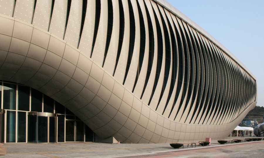
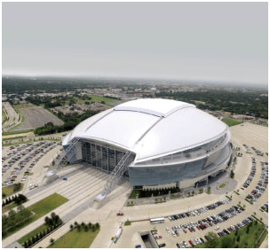
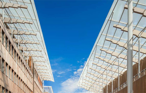
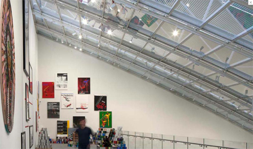
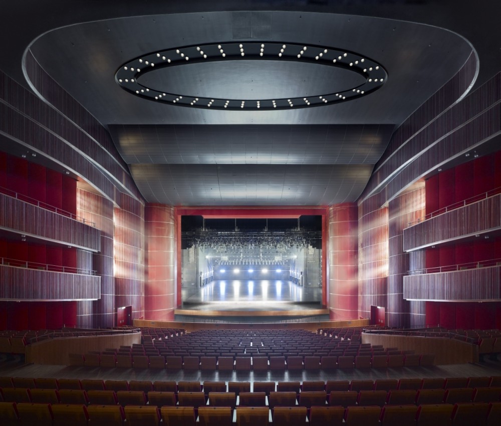
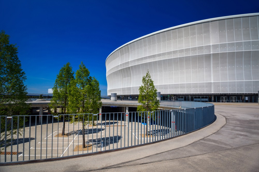
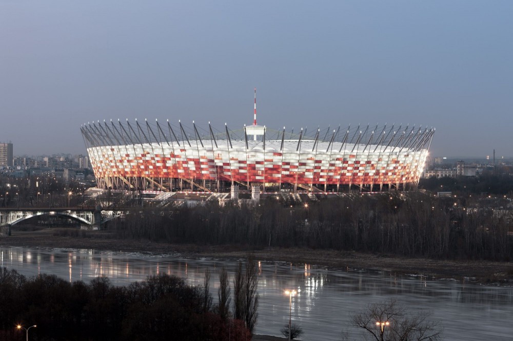
AT&T Stadium, home of the Dallas Cowboys in Arlington, Texas, features 19,000m2 of SHEERFILL® I with EverClean® Topcoat on the retractable portion of the roof. Photo: Saint-Gobain.

Liu explains that with this first type of technology, the goal is to develop textiles that do not allow pollutants to stick to the textile. “There are several chemicals that can do this in the world,” Liu says. “This technology is a dirt repellent, not ‘self-cleaning.’” The goal is to prevent dirt and microbial elements from sticking to and “dirtying” textiles and interior or exterior applications.

The second type of technology is hydrophilic and photocatalytic. “In this type of technology, we want the textile to have hydrophilic features, so we can clean it by water, even without using a cleaning agent,” Liu says. “The photocatalytic component can help decompose organics on the textile under the sun. This technology is actually self-cleaning, because we use rain and water to clean it automatically.”

TitanPE has some commercial anti-stick products, but the company’s major R&D is focused on hydrophilic and photocatalytic technology. Called TiPE™ self-cleaning nano coat, the special nano photocatalyst technology can be applied to the exterior of buildings to prevent mold, moss or dirt buildup. The coating can also improve the air around the building by purifying nitrogen oxide (NOx) generated by passing automobiles.

THE HYDROPHILICITY FEATURE

Detergents and cleaning agents reduce the surface tension of water and lower the contact angle on fabric surfaces. TitanPE Technology calls it the hydrophilicity feature. TiPE nano coat’s hydrophilicity will simulate this feature, so that a single water wash on the surface can achieve the same effect as a traditional cleaning with detergent.

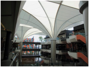
The Lampton Shopping Center in Thailand features a PVC-coated fabric display coated with photocatalyst. Photo: Taiyo Kogyo Corp.

According to Liu, when the surface of nano-level photocatalytic film is exposed to light, the contact angle of the photocatalyst surface with water is reduced gradually. As explained in the TiPE nano coat self-cleaning application manual, after enough exposure to light, the surface reaches super-hydrophilicity. In other words, it does not repel water at all, so water cannot exist in the shape of a drop, but spreads flatly on the substrate. The hydrophilic nature of titanium dioxide (TiO2), coupled with gravity, will enable the dust particles to be swept away following the water stream (rain), creating the key feature of self-cleaning and easy-cleaning.

Our self-cleaning technology has been used on buildings for several years, with many clients using water/oil repellent technology first and then turning to us,” Liu says. “But for textiles, it is just a beginning. Water- and oil-repellent technology is still much higher in sales, but we are pushing it to change.”

Evidence shows the older hydrophobic treatment chemicals to be harmful to the environment, Liu notes. “We want to use a safe and long-lived technology to develop a new commercial market. It needs to be safe, healthy, environmentally friendly and also inexpensive,” he says.

The first PVC-coated fabric with TiO2 was developed by Taiyo Kogyo Corp., Osaka, Japan, in 1997. Taiyo Kogyo has been selling the products commercially since 1998. Other companies also sell hydrophobic and anti-stick products, including 3M, St. Paul, Minn., and Daikin Industries Ltd., Osaka, Japan.

Liu says, “For the hydrophilic/ photocatalytic market, it is just in the beginning.” TitanPE is a leading researcher in the area, but Liu adds that much research is happening in the U.S., which includes activity at universities and some pioneering companies.

LET THERE BE UV

“One is the oxidative decomposition reaction of organic contaminants triggered by the redox reaction of TiO2, and the other is hydrophilic property induced by UV light, whereby UV irradiation on TiO2 produces hydrophilic groups (OH groups) on the surface of TiO2 and makes the surface hydrophilic and thus gives the surface high wettability,” Toyoda says.

The hydrophilic effect allows natural rain to wash off dirt from the surface. The TiO2 top coating solution was prepared by anatase titanium dioxide crystals and is bound with an inorganic binder that largely increases the adhesion strength to the substrate.

A PVC-coated fabric with a double-layered structure.According to Dr. Hiroshi Toyoda of the Technical Research Center at Taiyo Kogyo Corp., TiO2 photocatalytic coating technology for the PVC-coated fabric shows excellent self-cleaning effects on its surface under irradiation by UV light.

According to Toyoda, because the fabric with TiO2 stays cleaner than traditional architectural fabrics, cleaning fees can be reduced and the translucency stays high, minimizing the need for further artificial lighting, which in the end will reduce energy costs for the owner.

FINDING THE RIGHT MIX

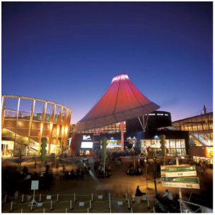
At the 2005 World Exposition in Aichi, Japan, the “Mountain of Dreams” display

featured a PVC-coated fabric with TiO2 coating. Photo: Taiyo Kogyo Corp. An example of this coating technology is Saint-Gobain’s Sheerfill® architectural membranes, which stay clean, white and bright even in very challenging environments. The fact that the fluoropolymer coating is easily rinsed clean by rain or plain water ensures a long service life with little regular maintenance, according to Michael Lussier, architectural sales and market manager at Saint-Gobain, Malvern, Pa.

“When our EverClean® Photocatalytic Topcoat was introduced to the market, our ‘easily cleaned’ coating became truly ‘self-cleaning,’” Lussier says. “By adding photocatalytic titanium dioxide to the topcoat, and simply exposing the material to sunlight—which is easy to do on a roof—a layer of activated oxygen forms at the surface, helping to reduce NOx pollution and breaking down organic contaminants. Since the TiO2 is a catalyst, it is not consumed in any of the reactions and remains available to provide the self-cleaning properties for the life of the membrane. Saint-Gobain has invested significant time, effort and money into applying the technology to our specific products.”

Lussier says that eliminating surface dirt on architectural structures is paramount, so when UV light hits the EverClean photocatalytic TiO2-based surface, hydroxy radicals (.OH) and superoxide radicals (O2-) oxidize(decompose) allorganicsubstances. Rain or water washes them away, keeping Saint-Gobain’s Sheerfill surfaces white. Maintenance cleaning is eliminated, as is the use of environmentally deleterious cleaning agents.

“The TiO2 layer is required for the PVC-coated fabric, which is used for the self-cleaning application,” Toyoda says. “It should be provided with a high photo-redox reaction ability to eliminate an oily plasticizer which migrates to the outermost surface.”

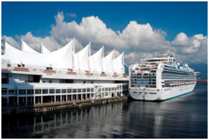
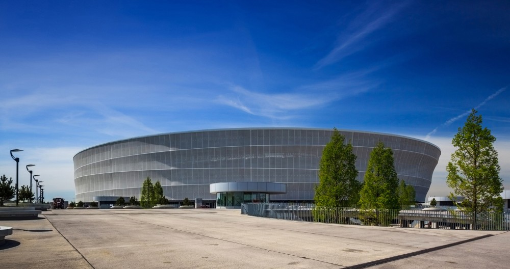
Canada Harbor Place in Vancouver, British Columbia, contains 10,000m2 of SHEERFILL® II with EverClean®. Photo: Saint-Gobain.

Saint-Gobain is one of the market leaders with respect to self-cleaning permanent architectural membranes. The company partnered with TOTO Ltd., Kitakyushu, Fukuoka Prefecture, Japan, in the development of the EverClean Photocatalytic Topcoat product; TOTO is a technical leader in the use of photocatalysts across a wide variety of products and materials.

As Lussier explains, the process of coating polytetrafluoroethylene (PTFE) onto fiberglass requires very high processing temperatures. “Finding the right TiO2 that is compatible with our materials and our processing was very challenging,” Lussier says. “It is not enough to simply add ‘TiO2’ to the coating—only the right TiO2, added in the optimum ratio, applied in the optimum manner, will provide the desired performance.”

It’s important to note that PTFE is unaffected by UV and virtually all chemicals and pollutants; the PTFE coating provides protection of the underlying fiberglass fabric, which is strong and unaffected by UV.

Adding catalytic, nano metal oxide particles to obtain self-detoxifying filter substrates is an area of focus at the Nonwovens and Advanced Materials Laboratory at Texas Tech University (TTU), Lubbock, Texas, according to Seshadri Ramkumar, Ph.D. Ramkumar is a professor at TTU’s Institute of Environment and Human Health.

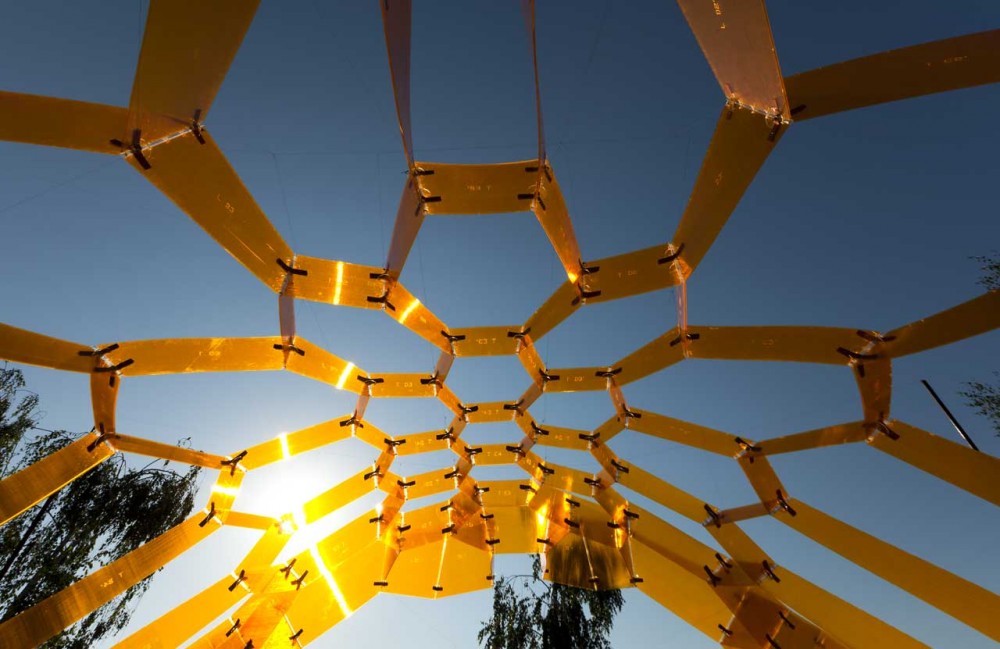
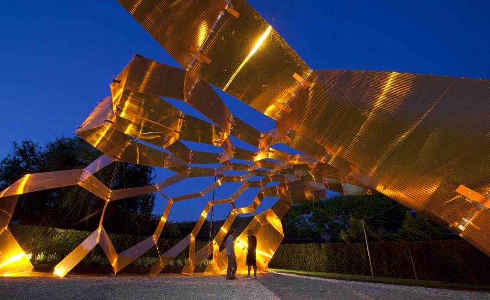
“While conducting this study, we observed self-assembly phenomenon in PU nano fibers, which mimicked honeycomb structures,” Ramkumar says. “These provide more surface area and hence can be better filter substrates.”

HANDLING AND CARE

Compared to other materials that do not provide the same performance with regard to lifetime, fire safety and low maintenance needs, Sheerfill does require a different approach with fabrication and installation. Fabricators, architects, designers and owners need to understand the unique properties of the material and how to utilize it to its full potential.

The purpose of self-releasing properties of interior and exterior textiles is to minimize or completely eliminate the need for ongoing care and maintenance of these textiles and coatings. With the EverClean topcoat, cleaning will seldom be needed. When cleaning is necessary, Saint-Gobain provides simple guidelines that include using water, mild pure soap and a soft brush.

ON THE HORIZON

As Liu explains, if we look at the “real” self-cleaning aspect of textiles, from hydrophilic and photocatalytic perspectives, the current commercialization of these textiles is still on a small scale.

“We are doing some commercializing of projects for this, but it is still on a very small scale—compared to first direction hydrophobic products in the moment, but it has a big potential. After all, it will provide extra bio-pollutant control ability, which traditional self-cleaning— hydrophobic—can’t. It will allow real self-cleaning applications in hospitals, for example,” Liu says.

Continueddevelopmentsareexpanding. For instance, Saint-Gobain is developing new products to address the evolving needs of the market. These needs include the use of colors, materials with higher light transmission, mesh fabrics for shading and facades and the desire to be “green,” all while maintaining or improving the aesthetics of the final structure and providing comfort for the occupants and users.

“There is good scope for the field,” Ramkumar says. “However, one has to look into cost benefit analysis. If we are targeting consumer textiles, cost also plays an important role. End users get a value-added product. Fabricators develop new lines of value added and high performance products. But, that said, the industry has to be always cognizant of the cost factor.”

Liu predicts strong interest in further commercializing the application for building textiles, air purification and water treatment to remove harmful chemicals.

“There will be increased growth in self-cleaning textiles for use in hospitals to help control bacteria, super bugs, mutant viruses without using heavy metal,” Liu says. “There will also be further development in textiles for strong active smell control ability—to remove smoke, human body smell, sweat smell.”

Future focus will be on biomimicry, wearables and sustainable products, according to Ramkumar. He notes that the advanced fabrics industry needs “to look outside the box and borrow ideas happening in non-textile and allied fields.” For example, developing porous textiles using the supercritical fluid concept.

“While current products focus on the photocatalysis triggered by UV light, we are developing novel photocatalysis that can be triggered by visible and infrared light,” Toyoda says. “This may provide further benefits to the current technology in order to find new applications.”

The terms used within the self-cleaning textile industry are numerous. Some of the key terms to know include:

  • Bioactive textile:
    Contains an active substance with a permanently antimicrobial effect.

  • Photocatalysis: 
    The acceleration of a photoreaction in the presence of a catalyst. In catalyzed photolysis, light is absorbed by an adsorbed substrate.

  • Nanotextiles:
    Textiles engineered with small particles that give ordinary materials advantageous properties.

  • ETFE coated:
    Ethylene tetrafluoroethylene (ETFE) is a fluorocarbon-based polymer designed to have high corrosion resistance and strength over a wide temperature range.

  • Lotus effect:
    Self-cleaning properties that are a result of ultra-hydrophobicity; dirt particles are picked up by water droplets due to the micro- and nanoscopic architecture on the surface, which minimizes the droplet’s adhesion to that surface.

Assembly One Pavilion / Yale School of Architecture Students

© Chris Morgan Photography’
The Yale ‘Assembly One’ pavilion is the younger, smaller, more carefree sister to Yale’s building project – a 40-year old tradition in which first-year students design and building a house. It is the product of a seminar and design studio in which students focused on alternative ways in which contemporary buildings can come together and the potential architectural effects computational and material techniques can offer. The ‘Assembly One’ pavilion is designed to act as an information center for New Haven’s summer International Festival of Arts and Ideas and therefore was developed with the following characteristics in mind: dynamism, visual transparency and visual density.
   
© Chris Morgan Photography


Dynamism: The structure is suited to a performance festival – solid and massive from one angle, lightweight and almost entirely porous from another, it alternately hides and reveals its contents.
Visual Transparency: Constructed from thin  sheets, the pavilion opens up on two sides for ventilation and security, focusing views toward the festival’s main stage.
Visual Density: Over 1000 panels create shifting effects of reflection and color as visitors move around the pavilion, creating less of a timeless image of shelter than an unstable, engaging heart of the festival.


“We treated the tenets of digital fabrication as basic assumptions – our ability to efficiently produce variable and unique components and the cultural implications of moving beyond standardized manufacturing. But, we were less concerned with the uniqueness of the objects we created than on the novel types of tectonic expression they allowed.”The Festival Pavilion was designed and built by  students.

Project Founders: David Bench, Zac Heaps, Jacqueline Ho, Eric Zahn
Project Managers: Jacqueline Ho, Amy Mielke
Design & Fabrication: John Taylor Bachman, Nicholas Hunt, Seema Kairam, John Lacy, Veer Nanavatty
Design: Rob Bundy, Raven Hardison, Matt Hettler
Faculty advisor: Brennan Buck
Assistant: Teoman Ayas
Consultant: Matthew Clark of Arup, New York

Generous support was provided by Assa Abloy, the Yale Graduate and Professional Student Senate, and the Yale School of Architecture. The Pavilion is on view on the New Haven Green until the end of June.
© Chris Morgan Photography

Catalan Free-form Vault design from ETH Zurich

A stunning Catalan free-form vault has been designed and build by students during a one week workshop organised by Prof. Deplazes and Prof. Block from ETH Zurich. RhinoVAULT has been used for the design of the complex compression-only shape. For details, visit the homepage of the BLOCK Research Group.

The Astrup Fearnley Museum of Modern Art – Oslo

The Astrup Fearnley Museum of Modern Art is a privately owned Contemporary Art gallery in Oslo in Norway. It was founded and opened to the public in 1993.

The collection’s main focus is the American appropriation artists from the 1980s, but it is currently developing towards the international contemporary art scene, with artists like Jeff Koons, Richard Prince, Cindy Sherman, Matthew Barney, Tom Sachs, Doug Aitken, Olafur Eliasson and Cai Guo-Qiang. The museum gives 6-7 temporary exhibitions each year. Astrup Fearnley Museum of Modern Art collaborates with international institutions, and produces exhibitions that travels worldwide.

The museum created a stir in the international art world in 2002 when it purchased the American artist Jeff Koons’s monumental sculpture in gilt porcelain of the pop star Michael Jackson with Bubbles, his favorite chimpanzee, for USD 5.1m.
In Oslo natural light is precious, particularly in the winter months. Using the available light was therefore the driving concept for The Renzo Piano Building Workshop when designing  the Tjuvholmen Icon Complex.

The three buildings are covered by the sweeping curved roof that comes right down to the park. Other materials are few and include timber cladding a reference perhaps to the traditional buildings of historic Norwegian fishing villages such as the beautifully preserved Hanseatic buildings of Bryggen in Bergen.
The roof is glazed and layered in such a way as to allow as much wintertime natural light into the museum and other buildings as possible. The light is filtered and defused to render the interiors, and exhibits naturally and with the welcome side effect of saving on electricity.

 The project is composed of three discrete buildings, a gallery an office and a culture centre and is set out along a new axis that connects the city to the sea along new canals ending in a floating dock. Along this route is a new outdoor sculpture park.

Photos: Nic Luhoux

The Astrup Fearnley museum is now officially open. The entire centre will provide a valuable cultural space for Oslo.

Adaptive Construction: A timber tensile roof that adapts to loads


Structures have always been designed for an exact maximum stress; this type of stress, however, generally only occurs very rarely and then only for a short period. As a result a large part of the building materials used today therefore serves these extremely seldom peak loads and is effectively seldom used. 

The aim of ultra lightweight structures developed at the University of Stuttgart is therefore to achieve a drastic saving of materials and a better reaction to dynamic loads through an active manipulation of the structure. In the case of the Stuttgart wooden shell this manipulation is achieved through hydraulic drives: these drives rest on the points of support of the shell and generate movements that compensate in a specific way for deformations and material stresses caused by wind, snow and other loads.

Institute for Lightweight Structures and Conceptual Design (ILEK) and Institute for System Dynamics (ISYS) of the University of Stuttgart in cooperation with Bosch Rexroth have realised an adaptive structure on a large scale for the first time. The shell made of wood is supported at four points. Three of these points can be moved individually by hydraulic cylinders and freely positioned in space. Sensors record the load status at numerous points on the structure. Targeted movements of the points of support counteract variable loads (for example through snow or wind) and thus reduce deformations and material stresses. Compared to conventional, passive structures this considerably reduces the use of materials for the shell. The load balancing takes place through a Rexroth control system which was especially developed for hydraulic drives. The core task of the control system is to implement the complex hydraulic control tasks of the shell structure. In this way the supporting structure can react to a change in the load status within milliseconds.

An active vibration dampening and the adaptation to changing loads can be applied in many areas of construction, for example in stadium roofs, in high-rise buildings, in wide-spanning façade constructions or in bridges. The results of the research project at the University of Stuttgart thus enable a completely new construction method which not only saves resources but at the same time also considerably increases the performance of supporting structures. The active dampening of dynamic loads (for example from the effects of wind, earthquake or explosions) namely enables not only a drastic reduction in weight but furthermore also reduces material fatigue and damage to the structure.

In order to be able to actively compensate loads and vibrations, these influencing factors initially have to be precisely recorded resp. predicted; a second step would be to calculate the necessary counter-movements in real time (and likewise promptly to implement them). Researchers from the University of Stuttgart developed simulation models for this purpose, enabling an exact prediction of the behaviour of the structure. The material stress as well as the vibration behaviour under static and dynamic exposure is thereby taken into account. These simulation models serve as a basis for the development of control concepts which calculate the necessary counter movements on load and vibration compensation depending on the recorded measured values. These movements are then precisely implemented through the hydraulics.

Read more about it Here and Here


Project participants: 
Institute for Lightweight Structures and Conceptual Design (ILEK), University of Stuttgart 
Prof. Werner Sobek, Stefan Neuhäuser, Christoph Witte, Dr. Walter Haase

Institute for System Dynamics (ISYS), University of Stuttgart 
Prof. Oliver Sawodny, Martin Weickgenannt, Dr. Eckhard Arnold
Bosch Rexroth AG, Lohr a. Main 
Dr. Johannes Grobe, André Fella

Contacts: 
Stefan Neuhäuser: Tel.: 0711 685-63705, 
Martin Weickgenannt: Tel.: 0711 685-66960,
André Fella: Tel.: 09352 18-1010, 

‘Honey Scape’ Landscape Pavilion

Architects: Gonçalo Castro Henriques, X-REF Architectural Research & Development
Location: Ponte de Lima, Portugal
Client: Municipality of Ponte de Lima
Partners: X-REF, BÖ01 project management, Dagol Lda
Collaboration: Paulo Teodósio, Pedro Torres e Pedro Negrão (MergeLab), Helder Carvalho
Project Area: 280 sqm
Project Completion: 2012


Honey Scape is a dreamy temporary pavilion made of interlocking hexagonal sheets (or combs) of alveolar polycarbonate that create a dazzling display of light and shadow. “The combs act in part as the voussoirs of a parabolic arc supporting each other,” the designers explained. This allows them to “adopt a configuration of a double curvature surface… and adjust its size to their relative position in the structure.”

The components were digitally fabricated and constructed on site using metal connectors and a cable system. The resulting low-tech, 280 square meter pavilion commissioned by the municipality of Ponte de Lima and completed earlier this year heralds a new type of bio-tech art. Its main purpose, in addition to introducing a new aesthetic into the public realm, is to establish ultimate synergy between people and the built and natural environment.
Golden Honey Scape Pavilion Mimics a Giant Honeycomb in Portugal Inhabitat – Sustainable Design Innovation, Eco Architecture, Green Building A low-tech construction system was developed to build this complex structure. The system was complemented with metal connectors and a cable system on site. As it happens in the hives, this system required cooperative work to be assembled and became a reality. Networking and self-organization, which have inspired artificial intelligence, also inspired this solution. It offers bio-tech-art for a symbiosis between human and nature.
The installation avoids mimicking or confronting the landscape, rather seeking a man, nature and technology synergy. The structure recreates the honeycomb rules adapting to a lightweight double-curved surface in alveolar polycarbonate. The hexagonal geometry of the honeycomb is set according to three references – the parabolic arch, the double curved surfaces and the process of material adaptation. So the combs act in part as the voussoirs of a parabolic arc supporting each other, adopting a configuration of a double curvature surface (hyperbolic paraboloid), and adjusting its size to their relative position in the structure. The combs are larger at the base, decreasing in size and height towards the top of the structure. The generation and manufacture of the components relied on the use of scripting and digital fabrication.

Built after winning an international landscape competition at Ponte Lima, Portugal, Honey Scape is temporary landscape pavilion by Gonçalo Castro Henriques of X-REF. This installation intends to shelter the visitor, captivating him by a dream-like atmosphere with aromatic plants. This atmosphere is defined by a light and transparent structure, based on a honeycomb, creating a dynamic of light and color throughout the day. More images and architects’ description after the break.

© Alexandre Delmar / JF Fotografia

DSSH Bridge Powered by the Sun, Purifying the Air

This shape-shifting helix bridge is a flexible tensile structure, by applying more tension to different points, a technological dynamic deformation can be achieved in response to the people crossing the bridge. It becomes a living element that responds to its use.  Not surprisingly, this design won the first prize at the Building to Building Pedestrian Bridge International Challenge.
The tensile skin incorporates Foldable Photovoltaic Solar Panels capturing energy from the sun to generate and supply electricity from a clean and sustainable energy. This makes the bridge self-sustainable. To go beyond green, the design includes Plants that clean and purify the air, transforming the pollution of the city in pure oxygen. Plants and the Breathable Membrane make a greener environment and a clean pedestrian tunnel.
 

Urban Redevelopment Project at Tainan Main Station Area


Architects: Maxthreads
Location: Tainan, Taiwan
Project Team: Max Yang, David Millar, Samya Kako
Competition Organizers: Bureau of Development Tainan City Government, Taiwan (R.O.C.) & INTA (International Urban Development Association)
Prize: Second Prize


The second prize winning vision for the Urban Redevelopment Project at Tainan Main Station Area responds to the extending aim of positioning Taiwan in general, and Tainan city in particular, as a major historical based tourism destination. Designed by Maxthreads, their strategy attempts to contribute to Taiwan’s economic diversification from its current infrastructure lead planning system. More images and architects’ description after the break.


Tainan main station master plan is imagined as a cultural based community and nature intervention, with sustainable residential development and the potential for natural habitat areas. It aims to be a cultural and vibrant edutainment intervention as well as a secluded haven of peace and tranquility. Tainan main station is conceived as a new gateway of Taiwan’s history.


The proposal aims to reconcile community and biodiversity. It will act as an eco-transitional urban device, transferring and linking the diversity of the surrounding urban districts and programs. The concept behind the master plan proposal derives from the area’s original function as transportation node. The proposal will maintain the areas historical identity, whilst providing a boundary free and a self-sufficient urban planning, incorporating a number of sustainability systems.

Grand Theater Qingdao


Architects: gmp architekten
Location: Qingdao, Shandong, China
Design Team: Meinhard von Gerkan, Stephan Schütz, Nicolas Pomränke
Project Year: 2010
Project Area: 60,000 sqm
Photographs: Christian GahlArchitects: gmp architekten
Location: Qingdao, Shandong, China
Design Team: Meinhard von Gerkan, Stephan Schütz, Nicolas Pomränke
Project Year: 2010
Project Area: 60,000 sqm
Photographs: Christian Gahl

The Grand Theater is situated on the eastern side of the city of Qingdao between a bay in the Yellow Sea and Mount Laoshan (1,130m above sea level). Because of the unique situation of the massif directly by the sea, the Laoshan ridge is often wreathed in clouds, which gives the landscape a unique, often mystical, setting.

The style of the building relates to the mentioned natural spectacle, with the massif and the lightness of the clouds reflected in the appearance of the Grand Theater. It rises from the landscape like a mountain — a cloud-like roof seems to wreathe the four buildings. The raised terraces in the surrounding park are reminiscent of a mountain plateau, and take their bearings both from the sea and the mountains.

In addition to the opera house a concert and a multifunction hall as well as a media center and a hotel are integrated into the complex.


The foyer of the opera house offers direct views of the sea. Audiences can enter the auditorium on two levels, either via the lower level, giving access to the large cloakrooms and the lower circle, or via the main foyer.


Stadion Miejski Wroc?aw

Architects: JSK Architekci 

Location: Wroc?aw, Poland
Architect In Charge: JSK Architekci 
Design Team: Zbigniew Pszczulny, Mariusz Rutz, Piotr Bury (project manager)
Project Year: 2011
Photographs: JSK Architekci

Project Area: 248,401 sqm
Landscape Architect: RS Architektura Krajobrazu
Structure: Schlaich Bergermann und Partner (steel structure), Matejko i Partnerzy Biuro Konstrukcyjne (RC structure)

Background
UEFA’s decision to select Poland and Ukraine as the hosts of EURO 2012 encouraged the city of Warsaw to organize an architectural competition for the new stadium which would hold 40 thousand seats and be prepared to host group matches of EURO 2012.  21 renowned architectural practices were invited to compete. Polish practice JSK Architekci was awarded with the first prize and in October 2007 the office was granted the commission to deliver the project.

Development site is 7km outside of Wroclaw city centre. Existing infrastructure surrounding the new stadium was improved by the new motorway bypass and the new tram line providing additional access to the site from west and north. Stadium development had a positive impact on the economical growth of the surrounding neighbourhood with plans of further development i.e. a new office park and the first in Poland shopping mall strictly adjacent to the stadium.

Concept design
The stadium building and its surrounding were designed to present both interesting architectural form and fulfil requirements of economical exploitation yet providing maximum functionality and flexibility. The design of the site plan emphasizes the main building of the stadium making it a dominant feature in the surrounding space. Platform surrounding the stadium on the entrance level (6m above the ground) descends gently (4% fall) to the ground level under the street overpass allowing a comfortable and collision free pedestrian connection to the railway and tram station to the south, also covering level 0 of the stadium plot with VIP entrance, driveway and parking places. Separating main stream of pedestrians from the remaining vehicular circulation routes created a friendly and welcoming entrance zone to the building.


This plateau provides the pedestrians with an extensive space and a roof for the parking lot and the service road. The plateau from the north western side is woven by with the rising plateau of the car park. This rising roof level of the car park hides the one for a shopping centre tied area. Conceived as a single tiered stadium with a uniform stand bowl, makes it possible for the spectators to be aware of a sporting event in a more exciting way. Despite the great building scale it has been successful to keep an intimate atmosphere on the whole stand. So we can experience a unique atmosphere. This stadium in its scale is one of the few with a single tier.


A clear and apparent scheme of the functional design makes a fluent admission into the stadium building possible. The bowl of the semicircular stand is attainable from 2 promenades on 2 levels. Numerous turnstiles which allows us to run onto the lower promenade are placed in a complete radius of the building. The upper promenade is easily attainable with the help of open stairwells. Both promenades form a kind and comfortable space with all possible welfare facilities (catering trade, toilets, first help, police). For a luxury the promenades were wrapped by a transparent membrane. On the one hand it offers protection of bad weather conditions, on the other hand it is closing the building form visually. The number of pillars was reduced considerably so that spacious and open promenades could be created.


Building rentable area organizing system is quite unique. Conventional designs usually locate rentable areas underneath tribune structures, Wroclaw’s stadium separates them from the structure by creating a promenade and a massive void allowing visitors admiring tribunes from underneath. Along promenades toilets and retail units ready to service 40 thousand visitors were located. Open staircases leading spectators up to the top level strengthen the feeling of openness and allow for the exposed reinforced concrete structure to be admired. Standing out mesh membrane is characteristic for the new Wroclaw stadium. It consists of a polytetrafluoroethylene covered fibreglass and is pushed on 5 ring beams of steel. The 5 ring beams refer by the horizontal geometry to the well-known Wroclaw’s modern architecture.


Stadium design was based on UEFA and FIFA guidelines supplemented with the experience of EURO 2006. All the tribune seats are roofed and provide unobstructed view of the pitch. Both promenade levels are duly serviced. On its western side business club and VIP hall were located.  Zone for footballers and media has been envisaged as well. Level +3 holds lodges with the conference rooms featuring rows of seats facing the stadium arena. Stadium will also be home to sport bar, offices, physiotherapy centre, fitness club, discotheque, casino etc. Diversification of available services allows the building to be used all day long.


Structure
The main bulk of the stadium building consists of three main elements:
– Tribunes construction of reinforced concrete.
– Steel construction of the roofing structure, with its oval shape repeated in the form of three rings at varying angles surrounding the building.
PTFE covered fibreglass mesh membrane stretched on the above mentioned steel rings.


Roof design is formed with the light cantilevered steel structure consisting of 38 radially spread trusses sitting on a pair of columns each (one is pressured the other tensioned). The stadium roof generally appears as membrane roof with a glass ring part designed to bring maximum amount of sunlight to the pitch.


Facade
Facade belting the stadium starts at the height of 3.5m above esplanade level.  Its structure consists of 5 steel beams – rings and it is covered with partially transparent mesh membrane. Façade’s form results from the shape and arrangement of the steel rings formed with curved steel pipes. The lowest and the highest rings are placed horizontally keeping distance of 30m between them. This dimension determines the height of the mesh membrane façade. Additional dynamic factor to the facade was achieved by setting inwards and sloping the middle rings and by shifting northwards the upper fourth ring. Due to the strength of local winds affecting the elevation mesh membrane proper simulation tests in the aero dynamical tunnel were conducted during the designing process.  Another simulation of smoke extraction was performed helping to properly design mesh grid and its factor of open area.


Summary
Thanks to façade treatment stadium appears to be light and transparent despite its massive size. The façade mesh protects the usable yet open space of the promenades from weather conditions such as rain and wind. Internal LED lighting system was introduced allowing the building to project light through the façade’s mesh from inside. Overall impression of the “glowing” building is similar to that of the Chinese lantern. Thanks to the LED technology colour and pattern of the lighting can be easily changed thus the building’s character can be visually adjusted to the planned event (such as EURO 2012, league and national tournaments, music shows or other mass events) and can generate particular feel to it following the current need.

Coca Cola Beatbox Pavillion

Architects: Pernilla & Asif
Location: London, UK
Design Team: Asif Khan, Pernilla Ohrstedt
Project Year: 2012
Photographs: Hufton, Crow

The Coca-Cola Beatbox, designed by Asif Khan and Pernilla Ohrstedt is an experimental fusion? of architecture, sport, music and technology that creates a stunning sensory experience. The visionary structure acts as a musical instrument, allowing visitors to remix Mark Ronson and Katy B’s ‘Move to the Beat’ Coca-Cola anthem ‘Anywhere in the World’ – as they pass through the building.

The Coca-Cola Beatbox forms part of Coca-Cola’s Future Flames campaign which aims to shine a spotlight on Britain’s brightest stars and inspire other young people to pursue their passions.


© Hufton & Crow

Coca-Cola has spent two years working with partners including The Architecture Foundation, the Royal College of Art and experimental theatre company London Quest.  Together, these organisations have helped Coca-Cola bring together the best in emerging talent across design, performance and technology as part of its commitment to using its sponsorship to shine a light on inspirational young people – its Future Flames.  The result is a pavilion that is created by, embodies and celebrates the passions of thousands of Coca-Cola Future Flames who make a positive contribution to their local communities every day.


© Hufton & Crow

Emerging London-based architecture collaborators Asif Khan, 32, and Pernilla Ohrstedt, 31, were given creative control by Coca-Cola following a formal commissioning process administered by The Architecture Foundation.  The dynamic pair have designed a pavilion that aims to connect young people to the Games by bringing together their passions for music and sport.  Inspired by Coca-Cola’s global platform for London 2012 – Move to the Beat – the pavilion has been designed to function just like a musical instrument.


© Hufton & Crow

Its giant crystalline facade structure is made up of over 200 red and white inflated ETFE cushions, each gravity-defying panel connected like a house of cards. Integrated within these panels is proprietary audio, illumination and interactive sensor technology, enabling the architecture to be embedded with rhythmical sport sounds from GRAMMY award winning Mark Ronson and Mercury Prize nominee Katy B’s Coca-Cola anthem ‘Anywhere in the world’ for London 2012. His recordings from Olympic athletes’ heartbeats, shoes squeaking, arrows hitting a target, amongst many others, are  triggered, played and musically remixed by an estimated 200,000 visitors’ gestures and proximity as they ascend the external spiral ramp on a 200m journey to the pavilion’s rooftop where they will enjoy spectacular views of the Olympic Park. The ramp then plunges down into the heart of the pavilion which will feature an interactive light installation created by Jason Bruges Studio.


© Hufton & Crow

Jason Bruge Studio’s Aerial Dynamics installation is a living, breathing light show that has been designed to emulate the effervescent energy released when a bottle of Coca-Cola is served and shared. 180 bespoke mechatronic ‘bubbles’ glow rhythmically in time with Mark Ronson’s track.  Controlled with individual code, each bubble has eight polypropylene blades that fold intricately in on themselves. Special sensors embedded in the three ‘cheers in celebration’ kiosks at the base of the Beatbox detect when Coca-Cola bottles are clinked together, triggering the blades and bubbles to glow with red and white LED lighting.  These light patterns become increasingly intricate as the number of participants grow.

Now that is a music box we’d like to have 😀

KK100 / TFP Farrells

Architects: TFP Farrells
Location: Shenzhen, China
Client: Kingkey Group
Structural Engineer: Ove Arup & Partners
Tower height: 441.8 m
GFA: 210,000 sqm
Completed: September 2011
Photographs: Carsten Schael, Fu Xing, Jonathan Leijonhufvud
—————————————————————


KK100, the tallest building in the world completed in 2011, is an inn.ovative high density project that takes an entirely new approach to city making. It is situated on the edge of Shenzhen’s CBD and sets a new precedent for the successful 21st century transformation of commercial districts into vibrant and enriching environments. The 3.6-hectare site was previously occupied by a dense but low-rise residential quarter, Caiwuwei Village. The developer had the creative vision to form a company with the villagers, initiating an entirely new approach to the art of place-making in Shenzhen.

Existing buildings were run down and living conditions were poor. As part of initiating this transformation, a Joint Development Initiative was formed in which villagers became stakeholders. Each owner was offered a new property as well as a second home which serves as an income generating asset. This meant the preservation of community links that are built over generations. In order to offset the cost of re-provisioning residences for the villagers, the tower had to be exceptionally tall so that the project could be financially viable.


The 100-storey, 441.8-metre tower comprising over 210,000m2 of accommodation is part of the master plan for a 417,000m2 mixed-use development. The development includes five residential buildings and two commercial buildings. The floors of the tower are divided into three major functions. The floors from level 4 to 72 will house 173,000m2 of Grade-A office space while the uppermost levels from 75 to 100 will be occupied by a 35,000m2 6-star St. Regis hotel complete with a cathedral-like glazed sky-garden animated by various activities. One of the design features is the curving building profile. This form alludes to a spring or fountain and is intended to connote the wealth and prosperity of Shenzhen.


The perimeter column arrangement provides each level with an unobstructed working environment and stunning views towards Lizhi and Renmin Park as well as over all Shenzhen and beyond. It does not use the typical square foot print; the East / West façades being more slender and flared slightly so office floor plates are slightly bigger and the South / North façades that face Hong Kong and the Maipo marshes are wider. The slenderness brings certain challenges, most notably the swing or drift ratio and the robustness of the tower and performance of key elements. Instead of putting generators on top of the building, the roof is constituted by a curved smooth glazed curtain wall and steel structure.

As well as providing social and cultural continuity, KK100 is integrated with the metropolitan transport network, which is crucial for a high density project such as this. The connectivity between the various components of the master plan on various levels was critical; the tower is integrated with the podium on various levels while retail and public uses at lower levels are integrated with the Metro system; the residential blocks are linked at the higher levels to create easier neighbourhood accessibility while direct office and hotel connections are also provided for easier movement of people. The Tower serves as a ‘’Mini-city” which provides an amenity-rich focal point back to the community, offering a 24-hour city-life to be better for the environment and human interaction.


The Stuttgart Station Saga

“A panel of know-alls”


Stuttgart – Excerpts from various newspapers… 

As a responsible planner of the statics the Stuttgart engineer Werner Sobek knows the construction project of the deep station to the smallest detail. In an interview Sobek increasingly objects to the reasons to which the project must be stopped because of safety concerns.

Mr. Sobek, your colleague Frei Otto calls the freeze of Stuttgart21 as threatened due to the construction site “danger to life and limb.” If the warning justified?

The warning is not justified in any way. I am shocked that Mr. Otto now expressed in this form – after many, many years has been involved in the project as an active planner and Stuttgart21 has known this for a long time so also the advice on the nature of the subsoil. These opinions do not say, that the project threatens or endangers life.

Mr. Otto warns of new underground station could be flooded by ground water or by the pressure of groundwater squeezed out of the ground uncontrollably. If you build in the groundwater, creating lift. It is known since Archimedes. The new Stuttgart main train station is between six and eight meters in groundwater. This is technically not a problem and the conditions of the city, if you go to the many parking garages, think light rail or commuter train tunnel, sensational in any way. On the contrary: The tubes of the S-and U-Bahn are for nearly 35 years in peace some six feet lower than the new station in the groundwater. And nothing has happened.

As a layman I would say that the subway station developed because of its size, a much higher lift than a narrow tube train. Is that correct?

Yes. But even the weight of the main station construction is sufficient to compensate for the buoyancy almost. It includes hundreds of stakes that anchor the station ten to 16 meters deep underground. This is an additional security. Overall, to the problem which Mr. Otto fears.

Mr. Otto said that he spoke his warning also of “moral obligation” of. Can you do with this concept in this context something?

I will not comment on that.

Try it.

At the Stuttgart 21 project some of the best and most prestigious Ingenierbüros are actually involved. This fellow can not just assume this way – even indirectly – that they would act irresponsibly or immorally. This is simply an absurdity.

================================================================


Stuttgart 21
co-creator of the station questioned
Michael Schmidt, 08/19/2010 17:28 clock

The 85-year-old Frei Otto does not currently mainly technical incalculable risks sufficiently into account. 


Photo: Zweygarth


“If a design takes long to realize, then, the plan has become obsolete. “

Frei Otto on one of the problems of the low station

One of two designers of the deep station for Stuttgart 21 suggests a new beginning of the planning. The 85-year-old Frei Otto, who for more than 13 years has together with the Düsseldorf architect Christoph Ingenhoven designed the characteristic “light eyes” and the shape of the new Stuttgart station, does not currently particularly unpredictable technical risks sufficiently into account. Above all, the Safety concerns the architect and engineer and complains that the current criticism is based primarily on the costs: “If we had had in designing the current level of information, I would be dominated by the idea of a low station moved away.” For a compelling reason why one would put the Stuttgart main station underground. Instead Otto is tinkering with the the idea of a high station in order to cross the Nesenbachtal. “A new plan could be mad to go fast, since there are now so much more information there than in the architectural competition in 1997.” The current hard-fought were on the side wings of the other option and this has ever been an issue for the architectural competition.


Geological factors affecting work 

“The purpose of the wings, which are for a station with steam locomotives because of the soot and smoke make it an absolutely necessity. Bonatz ‘grand gesture to the east has seen hardly anyone,” said Otto. . What made him much more strongly for a rethink, are the sum of the geological adversities and also insights and new and terrible experience of the behavior of crowds in the tunnel , “The main problem still remains: we sit down with the underground station in the groundwater, and it  rises up. How is the 400-meter long and 100 meter wide concrete trough in which sits the underground station, to be held then, so that it floats not. 

But can they be securely anchored? “asks the emeritus of the University of Stuttgart and founder of the Institute for Lightweight Structures in the face of the clay subsoil at Castle Garden. Also on another level, there are other problems with his creation: “Each design has its time has when it is not realized for long, then the plan becomes outdated and is flogged to death. Big projects who have no completion date, there is no psychological support” says Otto, who attained World fame for the design for the Munich Olympic roofs in collaboration with his colleagues in Stuttgart Gunter Behnisch 1972 .

Olympic Shooting Range – Temporary

With the London Summer Olympic Games rapidly approaching, there has been much talk about either the games are in fact economically good for a city. At its best, hosting an Olympics can help revitalize a city, and at its worst, playing host can leave the host-country drowning in debt.

There are a lot of reasons for this, but one is simply the cost of building new venues, all with a price tag to match their state-of-the-art design. When the athletes and fans pack up and go, the new stadiums and event-specific venues–for example, the Athens Olympics had a venue just for taekwondo– are often left empty, and unused far before the bill is settled.

In London, there has been a little of everything, from big name high-priced venues to littler, temporary structures. But how do you make a temporary building that still has an architectural impact? Perhaps in an effort to answer this question, London and Berlin-based Magma architecture came up with a design for the Olympic Shooting Gallery that could be dismantled, but that you won’t soon forget.
Olympic Shooting Venue by Magma Architecture

The shooting galleries for the London 2012 Olympic games are covered in spots that look the suckers of an octopus’ tentacles.
Olympic Shooting Venue by Magma Architecture
Designed by Magma Architecture of London and Berlin, the Olympic Shooting Venue comprises three PVC tents that have been erected at London’s historic Royal Artillery Barracks in Woolwich.
Olympic Shooting Venue by Magma Architecture
The extruded red, blue and pink circles draw ventilation inside each of the venues and also create tension nodes for the steel structure beneath the white skin.
Olympic Shooting Venue by Magma Architecture
Some natural light permeates this PVC membrane, while entrances are contained inside all the spots that meet the ground.
Olympic Shooting Venue by Magma Architecture
As the structures are only temporary, they will be dismantled immediately after the Olympics and reassembled in Glasgow for the 2014 Commonwealth Games.
Olympic Shooting Venue by Magma Architecture
Photography is by J.L. Diehl unless otherwise stated.
The text below is from Magma Architecture:

?London Shooting Venue
The London Shooting Venue will accommodate the events in 10, 25 and 50 m Sport Shooting at the 2012 Olympic and Paralympic Games in the southeast London district of Woolwich.
Olympic Shooting Venue by Magma Architecture
The first Gold Medal of the London Olympic Games will be awarded at the venue for Women’s 10 m Air Pistol on the 28th July 2012. After the event the three temporary and mobile buildings will be dismantled and rebuilt in Glasgow for the 2014 Commonwealth Games.
Olympic Shooting Venue by Magma Architecture
Shooting is a sport in which the results and progress of the competition are hardly visible to the eye of the spectator.
Olympic Shooting Venue by Magma Architecture
The design of the shooting venue was driven by the desire to evoke an experience of flow and precision inherent in the shooting sport through the dynamically curving space.
Olympic Shooting Venue by Magma Architecture
All three ranges were configured in a crisp, white double curved membrane façade studded with vibrantly colored openings.
Olympic Shooting Venue by Magma Architecture
As well as animating the façade these dots operate as tensioning nodes.
Olympic Shooting Venue by Magma Architecture
The 18.000 m2 of phthalate-free pvc membrane functions best in this stretched format as it prevents the façade from flapping in the windt.
Olympic Shooting Venue by Magma Architecture
Photograph by Steve Bates
The openings also act as ventilation intake and doorways at ground level.
Olympic Shooting Venue by Magma Architecture
Photograph by Steve Bates
The fresh and light appearance of the buildings enhances the festive and celebrative character of the Olympic event.
Olympic Shooting Venue by Magma Architecture
With the buildings being dismantled after the event an additional aim was to create a remarkable design which will be remembered by visitors and the local community thereby leaving a mental imprint the Olympic of shooting sport competition in Woolwich.
Olympic Shooting Venue by Magma Architecture
The shooting venue is not situated in the Olympic Park, but has its own location in Woolwich on the grounds of the historic Royal Artillery Barracks.
Olympic Shooting Venue by Magma Architecture
Photograph by Steve Bates
It is estimated that more than 104.000 spectators will watch the competitions.
Olympic Shooting Venue by Magma Architecture
Photograph by Steve Bates
The three buildings comprise 3.800 seats divided between two partially enclosed ranges for the 25 and 10/50 m qualifying rounds and a fully enclosed finals range. Together they form a campus on the green field.
Olympic Shooting Venue by Magma Architecture
Photograph by Steve Bates
Their up to 107 m long facades refer to the structured length of the Royal Artillery Barracks building, but have their own contemporary architectural expression.
Olympic Shooting Venue by Magma Architecture
Guided by the high requirements from the client, the Olympic Delivery Authority, sustainability was a key factor in shaping the design. All materials will be reused or recycled.
Olympic Shooting Venue by Magma Architecture
All three of the venues are fully mobile, every joint has been designed so it can be reassembled; and no composite materials or adhesives were used. In addition, the semitransparent facades on two of the three ranges reduce the need for artificial lighting and the ventilation is fully natural.
Olympic Shooting Venue by Magma Architecture
The tensioning detail was achieved through an efficient configuration of modular steel components commonly used in temporary buildings market. The double-curvature geometry is a result of the optimal use of the membrane material, which magma architecture has been experimenting with for a number of years, amongst others in the award winning head in I im kopf exhibition at the Berlinische Galerie in Germany.
Olympic Shooting Venue by Magma Architecture
Magma archtitecture was founded in 2003 by the architect Martin Ostermann and the exhibition designer Lena Kleinheinz. Central to our work is the use of complex geometric modeling as a way of creating a more spatially dynamic vocabulary. This is essential to better articulate and reflect the heterogenieity of our cities and global culture.
Olympic Shooting Venue by Magma Architecture
We seek to be part of a new paradigm within architecture – one that is expressionistic, rooted in non-linear form-making and facilitated by new materiality and cutting edge technologies.

Warsaw’s National Stadium wins World Stadium Award 2012


Designed by gmp Architekten, Warsaw’s National Stadium prevailed against international competition and won the World Stadium Award in the best multi-functional stadium design and most innovative use of technology categories in stadium design. On the occasion of the 2012 UEFA European Football Championship, the stadium was reconstructed on top of the existing – but since 1988 no longer used and dilapidated – earth wall stadium (Stadion Dziesieciolecia), and re-opened in January of this year.

The stadium’s construction consists of two succinct parts – the grandstand built of pre-fabricated concrete components and the steel wire net roof with a textile membrane suspended from freestanding steel supports with inclined tie rods above this. The interior roof consists of a retractable membrane sail which folds together above the center of the pitch. This is also where the four-screen “video cube” is installed so as to provide an optimum view from all seats. The top tier is accessed via 12 arch-shaped, single-flight staircases.


The exterior façade consists of anodized expanded metal that provides another envelope for the actual thermal shell of the interior areas and access steps. The panels with their red and bright silver color scheme appear either closed or transparent, depending on the light angle, and from a distance evoke the image of an artistic composition in white and red, the country’s national colors.


The stadium has been designed as a multifunctional events center and, with its approx. 20,000 sqm of office and conference facilities, comprises a comparatively high proportion of floor space which can be used independently of the stadium operation. These spaces are available for all types of events and include the necessary support facilities.


Architects: gmp Architekten
Location: Doha, Quatar
Design: Volkwin Marg and Hubert Nienhoff with Markus Pfisterer
Project Management: Markus Pfisterer, Martin Hakiel
Project Management (roof): Martin Glass
In cooperation With: J.S.K. Architekci Sp. z o.o. and schlaich bergermann und partner
Structural Design of Roof: schlaich bergermann and partners, Knut Göppert with Knut Stockhusen and Lorenz Haspel, M&E Engineering HTW, Hetzel, Tor-Westen + Partner, Biuro Projektów “DOMAR”
Landscape Design: RAK, Architectura Krajobrazu, Warsaw

General Contractor: Konsorcjum ALPINE BAU DEUTSCHLAND AG, ALPINE BAU GmbH, ALPINE Construction Polska Sp. z o.o., HYDROBUDOWA POLSKA S.A. i PBG S.A.

Client: Narodowe Centrum Sportu Sp. z o.o.
Seats: 55,000

Competition: 2007 – 1st prize
Construction Period: 2008-2011

Neri Oxman: On Designing Form

Neri Oxman is an architect and founder of MATERIALECOLOGY with the MIT Media Lab. Her work focuses on computational strategies for form finding; she chooses to define and design processes that generate form. She has published numerous papers and has contributed to various texts. Her work has also been featured at the MOMA for the exhibit “Design and the Elastic Mind“, which she designed four systems of processes. In this lecture posted by PopTech, Oxman discusses what the processes of nature can teach designers and how computational strategies defined by materials and the environment can expand the possibilities of the generation of form through algorithms and analysis.


Here is an excerpt of some of her thoughts in the video:

“Emergence can be defined by a spontaneous order, a self-organization, that appears in nature and natural processes. It can be studied on multiple scales; in the cells of plants and animals and in the traffic patterns of developed cities. Oxman points to processes in nature that are defined by the rules of biological functions and from which form are generated. Without a notion of the end result, the processes are based on their functionality, for example, how structural and efficient the stem of a plant is at supporting its weight and creating energy.

Oxman’s work is inspired by the quest for the origin of form and form finders of the 1970s that were led by material and environmental properties. Form, in this case, is an optimization of the function of a material in its environment – “what it wants to be”. Technology can and often is the guide that informs the exploration and eventually evolves from it. Oxman takes these notions many steps further with her work in “computationally enabled form finding”. The equation that she presents so simple that takes the variables of material properties and environmental constraints to generate form.

The inquisitiveness of Buckminster Fuller‘s designs for efficient structures was guided by the optimization of materials in form – such as a the geodesic dome. But his explorations of the Dymaxion automobile and house inpired ideas that pushed beyond what the materials wanted to be and into what the environment wanted to be, what society wanted to be – ideas that we are now reviving in our quest for sustainable architectural solutions. In the meantime, technology is taking nature many steps forward, rushing beyond the limits of what nature can do and defining a different existence that humans enjoy, setting us apart from the lifestyles of our ancestors.

And the tragedy that we have come upon is that our technological ambitions are destroying the earth and the natural processes that it relies upon. Somewhere in between the runaway advancements and the devastating effects they cause to our ecosystems is something Oxman calls “nature 2.0?. This is a considerable idea, involved with embracing the natural organizations of materials as well as their natural functions – so not just form, but also very explicitly function. She praises nature for being so efficient at multi-tasking: analysis, modelling and fabrication in one process.

In this model of “nature 2.0? and technology, the designer is an experimenter of generating options for forms under a variety of circumstances. Technology offers the tools to analyze, map and build upon observations and designers can use these tools in a variety of ways, some of which Oxman touches upon in her lecture.
The talk can get a bit heavy at times, but bear with it… it is an interesting thought and we wonder what it brings for us… especially the part of 3D printing parts of buildings and the part which she says – no separate wall no separate roof.. and that design exists because of 

Video via YouTube user PopTech.

New Terminal at Lucknow Airport / S. Ghosh & Associates

Courtesy of S. Ghosh & Associates


Architects: S. Ghosh & Associates
Location: Lucknow, India
Team: Sudipto Ghosh and Sumit Ghosh (Principle Designers) as well as Mitesh Kapadia, Rashmi Vakharia, Naeem Rushnaiwala and Ketan Bhartia (Associate Designers)
Terminal Area: 20,000 sqm.
Site Area: 56,000 sqm.
Total Cost: Approx. US $ 23 million
Photographs: S. Ghosh & Associates


Courtesy of S. Ghosh & Associates


Unlike most buildings that bear the influence of the place where they take root, the Airport terminal of Lucknow, seems like it has an additional obligation to the sky. The intention of the architect was conceived with the primal image of plane in mind, the design explores the aesthetics of flight through the large wing like cantilevers spanning 26 meters.


The folds of the roof bring in glare free natural light to large double height areas of the terminal.The airports belong as much to the ether that keeps the air-crafts buoyant, as to the cities to which they become gateways. The notion of flight and man’s mythic fascination with it is reborn in every child as he folds his paper plane to launch it into the sky. The paper plane with its supple, folded wings – the symbol for that elemental flight that catches our fancy as children – becomes the starting point for the design of Lucknow Airport.


Courtesy of S. Ghosh & Associates


The terminal building’s elevation to the sky resembles the folded wings of the paper plane. Large wing-like cantilevers on either side of the 200m long terminal building suggest lightness and swiftness. The building itself appears as a dynamic object preparing to take flight. Inside, the gently curving ceiling gives the feeling of being under the belly of a giant aircraft.


Courtesy of S. Ghosh & Associates


The design of the building does not labor to represent the culture and heritage of the city, instead gets imprinted with the architects’ own experiences: nightmares about an aircraft crashing down through the roof, the exhilaration of flight, lightness, the indented front of the city as it wraps around the Gomti river, the ruins of the British Residency after the 1857 mutiny-ancient and unhomely, etc. Frosted etchings on the glass façade of the building bear the intricate patterns of chikankari work, Lucknow’s famous embroidery work.


Ground Floor – Courtesy of S. Ghosh & Associates


The terminal is designed as a one and a half floor integrated terminal with clear movement paths for international and domestic travelers. There are two security holds on the ground floor for connectivity by bus and two on the first floor for approach to the aircraft through passenger boarding bridges. Three passenger claim belts of 60m lengths have been provided for the arriving passengers. Modern facilities of international standards are important for the country’s new terminals. These not only bring revenue to the airport but also make flying a much more pleasurable experience. 


The terminal building is friendly towards the physically challenged, there are no mobility thresholds and all floors are accessible by lift.


The structure is formed by a set of variable span portals with fixed connections spanned across by variable space trusses that form the final form of the ‘wings’. The design of the section of the portal has been arrived at using a composite of rolled sections forming an overall dimension of 733mm by 375mm. The maximum span of the portals is roughly 43m. The maximum cantilever achieved by the space trusses is 24m.


Structural Consultants: Descon United Pvt. Ltd.
MEP Consultants: Spectral Services Consultants
Landscape Architects: Design Accord
Lighting Consultants: Lighting Design Works
Acoustic Consultants: Suri & Suri
Glazing Consultants: Dema Consulting


Project Description provided by S. Ghosh & Associates.

SPRING CHALLENGE 2012

The IoA SPRING CHALLENGE event was an international design workshop intended for architecture students to explore integrated digital design and fabrication tools.

Architectural Design is taught at this university as an integrated, multidisciplinary process. Following this tradition, the design process was enriched with structural testing of parametric models in Karamba, a structural analysis plugin for Grasshopper. The handling of virtual simulation methods in the fields of parametric and digital production was the primary focus of the workshop. This week long intense workshop did result in a full scale built structure.


Format & Output

The Challenge Program was organized as a six day event with 22 international students and 6 tutors. Introduction to Rhino/Grasshopper/Karamba was followed by project design development and daily reviews of student group projects which entered into a competition mode. The selected project was fabricated and assembled as a group effort. The event closed with an exhibition and presentation with guests. The output was a parametrically designed and digitally produced human scale structure fabricated out of corrugated cardboard.

We’d Wish such workshops were organized here in India too.. 

Students: Shota Tsikoliya, Lenka Januskova, Clemens Conditt, Tu?gen Kukul, Maria Smigielska, Ceren Yönetim, Maciej Chmara, Oana Bogatan, Djordje Stanojevic, Rene Meszarits, Andreas Quast, Marco Pizzichemi, Zhenyu Yan, Ji?í Vítek, Johanna Jõekalda, Raouf M. Abdelnabi, Özlem Altun, Tadeas Klaban, Abraham Fung, Artur Staškevitš, Benjamin Ennenmoser, Roberto Naboni

Instructors: Andrei Gheorghe, Bence Pap, Trevor Pat, Irina Bogdan, Clemens Preisinger, Moritz Heimrath

Location: University of Applied Arts, Vienna, Austria

Status: Student Workshop

Year: Spring 2012

Kent Bridges: The Eureka Skyway

First, it has a silly name, the “Eureka Skyway”. Lets just call it the M20 Ashford Footbridge. It links two retail parks either side of the motorway, and also acts as a gateway to Ashford itself, an indication to motorway users that perhaps something of significance can be found here.


The £8m bridge was designed by Nicol Russell Studios with Jacobs, and built by BAM Nuttall. It was installed in May 2011 and opened in September 2011. There were rumours before it opened that it suffered from “wobble”…


Three immediate precedents come to mind when viewing the Ashford bridge: Lancaster’s Lune Millennium Bridge (2001), and Newport’s City Footbridge (2006) are two. Closer to Ashford, Maidstone’s Lockmeadow Footbridge (1999) has a similar form. All four bridges share a resemblance to a giant crane, with twin masts tied together with cables, and a deck supported from cable stays. There are some structural advantages to this arrangement, chiefly that the angle of the cables supporting the deck is steeper, and hence they provide a stiffer and more efficient support. A significant disadvantage is that maintenance is more difficult, as cables are required with no low-level termination, making it more difficult to adjust or replace them in the future.


When the preliminary visuals for this bridge came out some time ago on the architect’s website, I thought it looked quite nice, appealing in its height and slenderness. In real life, the sheer scale of the bridge is much more difficult to accept. The bridge deck is roughly 100m long, with a 67m clear span. The masts are 38m high. It’s nowhere near as big as the Newport bridge (70m tall, 145m main span), but it’s still a very large structure to span a motorway. The span length is driven by the presence of two motorway slip roads, and a watercourse, forcing the bridge to be much larger than is normally required on motorways.


The bridge looks attractive enough when viewed from the motorway, but as a pedestrian it is quite overpowering. The masts tower far above you, and their angle of inclination makes them loom in a way that I don’t recall experiencing with vertical masts.


What seems like a simple enough cable system when viewed in elevation becomes not only complex but positively confusing from most other perspectives. This is true of the forestays, but doubly so for the backstays. As well as tying the masts back to anchorage foundations, these also support a secondary deck, which curves below the main deck and provides part of a shallow gradient ramp access to the bridge’s north end. The end result is a web of cables with little apparent visual order.


In the main span, the confusion is partly caused by the presence of a set of tie-down cables, two on each side of the deck, which anchor the foremast to the foundations. These are an odd presence on an asymmetric cable-stayed bridge, where normally the anchor cables are only required at the “rear end” of the bridge. Here, I guess the main deck is insufficiently heavy to hold the main masts in place on its own, or they are needed because the masts are offset to the side of the deck, or they minimise movement and vibration in the masts. Compare the Swansea Sail Bridge as an example of a cable-stayed bridge with an offset mast which doesn’t need to be tied down in this way (and where the mast has been more artfully shaped).


Below deck, the oddest feature is a Y-shaped strut which holds the deck in place, presumably to restrain either vertical or lateral movement, or both. It has a sort of “tacked-on” feeling. My initial thought was that a corbel from the masts would have been better, but it’s not clear which mast you would add the corbel too, and what the effect on structural behaviour would have been. The view from below also highlights the somewhat rudimentary details where the cables are anchored to the deck.


The approach ramps at each end of the bridge are also very heavy, largely because of their height above the surrounding ground. There’s a stone-walled ramp at the south end, and an earth mound at the north end, into which stairs and a spiral ramp are cut. Growth of landscaping over time will help soften these, but they weigh the bridge down rather than allowing its slenderness to float free.


Overall, it’s a bridge which had the potential to be great, but which is let down by the awkward resolution of many of the details. Notwithstanding the funder’s desire for a gateway structure, I found the sheer scale to be oppressive. The bridge at Swanscombe spanned the motorway with delicacy and modesty – the one at Ashford has neither.

The New BAUHAUS MUSEUM at Weimar

The construction of the New Bauhaus Museum is a project by the Klassik Stiftung Weimar. The planned museum will be built near the Weimarhallenpark and will present the Weimar collections of the State Bauhaus, which was founded in Weimar in 1919. The museum is scheduled to open in 2015.

The Gropius Collection, owned by the Klassik Stiftung Weimar, is the world’s oldest collection of original Bauhaus works. The collection was significantly expanded with the acquisition of the Ludewig Collection in 2010, which contained 1,500 objects of functional design dating from 1780 to the present, including important Bauhaus works. Aside from the Bauhaus Archive in Berlin, the Bauhaus collection in Weimar is unarguably one of the world’s most important in terms of size and quality.


Awards:

A total of €169,000.00 has been set aside for prizes, allotted as follows (all prizes incl. value-added tax; net
sums in parenthesis):
1st prize €55,000.00 (€46,218.49)
2nd prize €45,000.00 (€37,815.13)
3rd prize €32,500.00 (€27,310.92)
4th prize €20,000.00 (€16,806.72)
5th prize €10,000.00 (€8,403.36)
For commendations: a total of €6,500.00 (€5,462.18)


Budget: 

The funding body provided the following budget for the construction of Weimar’s new Bauhaus museum: 

cost of construction alone = sum for building (cost groups 300 + 400): €14.500,00 gross.

Design Challenge: 
Weimar owns a unique collection on the background, history and after-effects of “Staatliches Bauhaus“, which was founded there in 1919. In 1995 a temporary Bauhaus museum was set up. Thanks to a special funding programme run by the German government and the state of Thuringia, the Klassik Stiftung Weimar foundation was able to set up a new Bauhaus museum in Weimar. This project is part of the ‘Kosmos Weimar‘ master plan, which covers all the foundation’s facilities, giving Weimar the opportunity to set a succinct example in terms of architecture and urban development.

The purpose of the competition was to find the best solution both for the new Bauhaus museum itself and for the location’s urban development potential. The competition was to be split in two parts – he first stage of the competition was the development of a fundamental design concept, selecting a suitable location and tackling the open spaces surrounding it in the context of urban planning. Furthermore, the urban design concept in Stage 1 is to plan for a possible future museum extension and a kindergarten.

In the second stage of the competition the focus is on working in greater detail on the architectural and interior concept of the new museum building. The solution to the task is expected to fit in with urban planning, be architecturally innovative and sustainable, save energy and stand up to museological requirements.

On 16. March 2012 the international jury awarded two second-place and two third-place prizes and conferred three honourable mentions

The design proposal for the New Bauhaus Museum by Pedro Monteiro, Rodrigo Cruz, and Sérgio Silva establishes a volumetric relation with the Gauforum in regard to its location. The first thing you see is a tower of light. It leads the way. As you walk along the narrow line of Oskar Schlemmer’s logo, you are entering Bauhaus. As it gains depth, the two-dimensional design of the logo becomes a geometrical stone sculpture. Its occupation defines its architecture.

A first building, made of glass and steel, marks the beginning of the access route to the museum while a stone pathway leads to the museum entrance and the ground floor. This is where the social areas – foyer and café – are located The exhibition areas and the cinema are located in the underground floor, as well as a viewable depot for items from the Weimar Bauhaus collection. The depot’s location allows it to be a part of the exhibition, as well as to be used independently.


The exhibition areas are organized around a courtyard that may be used as an outside exhibition area, or as a venue for other events (Bauhaus Theatre, larger conferences, etc.). The floors above include the spaces where the access is more exclusive: the pedagogical areas on the first floor and the offices on the second floor.


The location of the exhibition areas under the ground is a consequence of the necessity to control their environment as much as possible. Since the terrain remains stable, those areas benefit from geothermal mass to reduce the need for insulation and mechanical control of the temperature. The courtyard organization, as a cloister, guarantees the natural circulation of air in those areas. The ventilated facade in stone assures that the rest of the building, where the environment conditions are not as demanding, is properly insulated and ventilated, reducing energy other expenditures.


The announcement of the winners officially concluded the architectural design competition. The two second-place prizes went to Johann Bierkandt (Landau) and the Architekten HKR (Klaus Krauss and Rolf Kursawe, Cologne). 

The two third-place prizes went to Prof. Heike Hanada with Prof. Benedict Tonon (Berlin) and Bube/Daniela Bergmann (Rotterdam)

Three honourable mentions were awarded to the proposals by Karl Hufnagel Architekten (Berlin), hks Hestermann Rommel Architekten und Gesamtplaner GmbH (Erfurt), and menomenopiu architectures/Alessandro Balducci (Rome).


The Klassik Stiftung Weimar will now begin negotiating with the four prize winners according to VOF procedure (Contracting Regulations for the Awarding of Professional Services). The jury provided the winners with recommendations for optimising their proposals in preparation for the VOF procedure.


All proposals of the second round of the competition are displayed at the Neues Museum in Weimar.


Expo 2012 Yeosu Pavilion : So what if we didn’t win the competition…

Thematic Pavilion EXPO 2012 Yeosu
Design: soma architecture, Vienna – Salzburg
One Ocean, Thematic Pavilion EXPO 2012 Yeosu, South Korea
The Thematic Pavilion for the EXPO 2012 planned by the Austrian architecture office soma will be opened in Yeosu on 12th of May. soma’s design proposal One Ocean was selected as the first prize winner in an open international competition in 2009 – one which Katayun and I had participated in. We did come reasonably close for our means, and surprisingly ahead than some architectural firms. 

The main design intent was to embody the Expo’s theme The Living Ocean and Coast and transform it into a multi-layered architectural experience. Therefore the Expo’s agenda, namely the responsible use of natural resources was not only visually represented, but actually embedded into the building, e.g. through the sustainable climate design or the biomimetic approach of the kinetic façade. The cutting-edge façade system was developed together with Knippers Helbig Advanced Engineering and supports the aim of the world exhibition to introduce forward-looking innovations to the public. Below is a video of the architects rendering that was submitted for the competition. Pretty much cutting edge for 2009.


The pavilion inhabits the thematic exhibition that gives visitors an introduction to the EXPO’s agenda. The permanent building is constructed in a former industrial harbor along a new promenade.

Below are some other design explorations by other companies which were runnersup to the competition…


This one’s by Shigeru Ban


Design Concept


Continuous surfaces twist from vertical to horizontal orientation and define all significant interior spaces. The vertical cones invite the visitor to immerse into the Thematic Exhibition. They evolve into horizontal levels that cover the foyer and become a flexible stage for the Best Practice Area.

Continuous transitions between contrasting experiences also form the outer appearance of the Pavilion. Towards the sea the conglomeration of solid concrete cones define a new meandering coastline, a soft edge that is in constant negotiation between water and land. Opposite side the pavilion develops out of the ground into an artificial landscape with plateaus and scenic paths. The topographic lines of the roof turn into lamellas of the kinetic media façade that faces the Expo’s entrance and draws attention to the pavilion after sunset.

Biomimetic kinetic facade

As a counterpart to the virtual multimedia shows of the thematic exhibition taking place in its interior spaces, the kinetic façade like the overall building emphasizes the manifold potentials of analogue architectural effects. Although movement is intrinsic to any media facade, architecture is usually considered as the stable, immobile background for it. By involving real movement the kinetic facade aims to unify those usually isolated layers of architecture and media and define it as an interrelated and inseparable three-dimensional experience. The elegant opening movement of the lamella is based on elastic deformation properties of fiber reinforced plastics and was deduced from biological moving mechanisms.

The facade covers a total length of about 140 m, and is between 3 m and 13 m high. It consists of 108 kinetic lamellas, which are supported at the top and the bottom edge of the façade. The lamellas are made of glass fiber reinforced polymers (GFRP), which combine high tensile strength with low bending stiffness, allowing for large reversible elastic deformations. The lamellas are moved by actuators on both the upper and lower edge of the GFRP blade, which induce compression forces to create the complex elastic deformation. They reduce the distance between the two bearings and in this way induce a bending which results in a side rotation of the lamella. The actuator of the lamellas is a screw spindle driven by a servomotor. A computer controlled bus-system allows the synchronization of the actuators. Each lamella can be addressed individually within a specific logic of movement to show different choreographies and operation modes. Upper and lower motors often work with opposite power requirements (driving – braking). Therefore generated energy can be fed back into the local system to save energy.

Beside their function to control light conditions in the foyer and the Best Practice Area the moving lamellas create animated patterns on the façade. The choreography spans from subtle local movements to waves running over the whole length of the building.
After sunset the analogue visual effect of the moving lamellas is intensified by linear LED bars, which are located at the inner side of the front edge of the lamella. In opened position the LED can light the neighboring lamella depending on the opening angle. The material performance of the biomimetic lamellas produces an interrelated effect of geometry, movement and light: The longer the single lamella – the wider the angle of opening – the bigger the area affected by light.
The seamlessly moving façade that is continuously integrated into the building’s skin was already proposed in the competition and developed together with Knippers Helbig Advanced Engineering during the planning phases. To achieve the architectural intention a mechanical solution that applies hinges and joints seemed inappropriate, therefore a biomimetic approach was chosen. The technical solution was furthermore inspired by a research project at the ITKE University Stuttgart that investigates how biological moving mechanisms can be applied in an architectural scale. As a moving, emotional experience the kinetic façade combines sensations with the sensational, while communicating the Expo’s theme in an innovative and investigative way.

A Giant ball of Gas in Washington DC.. hey what’s new??

Even though the proposed bubble at the Hirshhorn Museum hasn’t yet inflated yet (latest plans for inflation are October 2012) it has won a progressive architecture award from the Architect, the magazine of the American Institute of Architects. The controversial bubble, designed by New York firm Diller Scofidio + Renfro, earned praise from the magazine for its playful and vibrant nature.


Says the magazine:

“Both installation and building, the air-filled structure challenges long-standing perceptions of what a museum means as a public space, how it encourages pluralistic audiences, and what it is able to exhibit. Its presence underscores a paradigm shift at the Hirshhorn: The museum is growing in importance as a place for dialogue and education extending beyond the traditional art world.”

In case you missed the plans of the bubble, it will be an inflatable membrane, squeezing into the museum courtyard and transforming it into an auditorium, cafe, and meeting place. Plans are to erect the bubble for one month in the spring and fall.

The magazine also displays some new renderings of the bubble, showing more details of the structure (if you can call it that).


Liz Diller, founding principle of Diller, Scofidio + Renfro, shared the story of creating the pneumatic addition to the Hirshhorn Museum in Washington, DC. Commonly known as the “Bubble”, the inflatable event space is planned for the cylindrical courtyard of the National Mall’s modernist museum that was originally designed by Gordon Bunshaft in 1974. The first inflation of the “Bubble” is expected to take place at the end of 2013.


Below is a TED talk by Diller about the balloon, height, perceptions etc etc.. would be fun to see how they stabilize the balloon in winds… 


The thin translucent membrane will fill the center of the Gordon Bunshaft building. Its sky blue tone will be darkest at the top and it will become more and more transparent toward the bottom floors so visitors can enjoy the sensation of looking up and practically being outside. Cable rigs compressing various areas of the bubble as it climbs up and over the museum ceiling give it a unique doughy look in stark contrast to the hard angular building.


The main floor of the Hirshhorn’s Bunshaft building includes 14,000 square feet of outdoor and courtyard space. The bubble will be erected during chillier seasons, allowing visitors to enjoy the open spaces year round with fun cushy seats scattered throughout, mimicking the softness of the walls. A giant water tube around the bottom of the bubble weighs the massive inflatable structure down and also acts as a bouncy bench.


The temporary inflatable space will also feature a make-shift auditorium that will seat up to 1,000 people for art films, events, lectures, and even site-specific installations. The Hirshhorn Bubble project has been in the works for almost two years and is expected to take form in the winter of 2012.

Herzog & de Meuron and Ai Weiwei’s Serpentine Gallery Pavilion


Fig. 1.1 A superimposition of the previous pavilions.
As announced back in February, Swiss architects Herzog & de Meuron and their Chinese collaborator Ai Weiwei will be  designing this year’s Serpentine Gallery Pavilion at Hyde Park in London, a special edition that will be part of the  London 2012 Festival, the culmination of the Cultural Olympiad. This will be the trio’s first collaborative built structure in the UK. If you do not know who weiwei is – you definitely know the “bird’s nest” which was designed for the last Olympics… They are the same guys…


For those who don’t know what the whole brouhaha is about… Have a look at the info-graphic which covers all previous pavilions done by world famous architects.
Back when, it was announced, they had said that their design will explore the  hidden history of the previous installations, with eleven columns under the lawn of the Serpentine, representing the past pavilions and a twelfth column supporting a floating platform roof 1.4 metres above ground, which looks like a reflecting water-like surface in the renderings. The plan of the pavilion is based on a mix of the 11 previous pavilions’ layouts, pavilions that are represented as excavated foundations from which a new cork cladded landscape appears, as an archeological operation.

This year’s Pavilion will take visitors beneath the Serpentine’s lawn to explore the hidden history of its previous Pavilions. Eleven columns characterising each past Pavilion and a twelfth column representing the current structure will support a floating platform roof 1.4 metres above ground. The Pavilion’s interior will be clad in cork, a sustainable building material chosen for its unique qualities and to echo the excavated earth (i guess the “echo” would not be heard if they use cork, and its a clever use at a metaphor. Taking an archaeological approach, the architects have created a design that will inspire visitors to look beneath the surface of the park as well as back in time across the ghosts of the earlier structures. (maybe they wanted to say – we couldn’t really do better, so might as well mish-mash old designs put one extra column – and say – hell we DID do something!!!)

Julia Peyton-Jones, Director, and Hans Ulrich Obrist, Co-Director, Serpentine Gallery, said: “It is a great honour to be working with Herzog & de Meuron and Ai Weiwei, the design team behind Beijing’s superb Bird’s Nest Stadium. In this exciting year for London we are proud to be creating a connection between the Beijing 2008 and the London 2012 Games. We are enormously grateful for the help of everyone involved, especially Usha and Lakshmi N. Mittal, whose incredible support has made this project possible.


The Serpentine Gallery Pavilion will operate as a public space and as a venue for Park Nights, the Gallery’s high-profile programme of public talks and events. Connecting to the archaeological focus of the Pavilion design, Park Nights will culminate in October with the Serpentine Gallery Memory Marathon, the latest edition of the annual Serpentine Marathon series conceived by Hans Ulrich Obrist, now in its seventh year. The Marathon series began in 2006 with the 24-hour Serpentine Gallery Interview Marathon; followed by the Experiment Marathon in 2007; the Manifesto Marathon in 2008; the Poetry Marathon in 2009, the Map Marathon in 2010 and the Garden Marathon in 2011.


The 2012 Pavilion has been purchased by Usha and Lakshmi N. Mittal and will enter their private collection after it closes to the public in October 2012.


The Serpentine Gallery Pavilion 2012 designed by Herzog & de Meuron and Ai Weiwei will take place from 1 June to 14 October 2012. Those lucky to be in the neighborhood – do visit – the rest – rely on low res internet downloaded images…


TED Talk: Daniel Libeskind’s 17 words of architectural inspiration


Filmed back in 2009, this TED Talk by Daniel Libeskind has yet to diminish in popularity. Once a free-verse poet, an opera set designer and a virtuoso musician, Libeskind has evolved into an internationally-renowned architect with an illustrious style that has been praised and criticized by many. In just seventeen words, Libeskind describes what inspires his unique approach to architecture. Believing that optimism is what drives architecture forward, he begins by stating, “Architecture is not based on concrete and steel and the elements of the soil. It’s based on wonder.”
Enjoy the talk and continue after the break to review Libeskind’s seventeen words of architectural inspiration.
Libeskind’s seventeen words of architectural inspiration:
  • Optimism vs. Pessimism
  • Expressive vs. Neutral
  • Radical vs. Conservative
  • Emotional vs. Cool
  • Inexplicable vs. Understood
  • Hand vs. Computer
  • Complex vs. Simple
  • Political vs. Evasive
  • Real vs. Stimulated
  • Unexpected vs. Habitual
  • Raw vs. Refined
  • Pointed vs. Blunt
  • Memorable vs. Forgettable
  • Communicative vs. Mute
  • Risky vs. Safe
  • Space vs. Fashion
  • Democratic vs. Authoritarian
It is evident that many will form a variety of opinions about Libeskind’s philosophy; however, it is always interesting to learn about different ideologies and inspirations. Tell us, what inspires you?